HHest
Re:Was Vincent van Gogh color blind? (2012)
on Tuesday September 06, 2022 @12:01PM (#32738990)
The link labelled as "seen some of van Gogh’s work in what he calls a color vision experience room" is a better link than the one labelled as "a number of striking examples of the master painter’s works reimagined"
Re:Why I built a dictionary app
on Monday August 01, 2022 @07:51AM (#32304694)
I think this is also a mechanism for languages to evolve: for whatever reason people start using a word differently from the dictionary definition. After a while if it has enough support the new usage gets added in. Sometimes the new way can be so entrenched that the old definition becomes archaic.
Re:CalTech wins $1.1B jury verdict in patent case against Apple, Broadcom
on Friday January 31, 2020 @04:47AM (#22200357)
Reference?
Re:California fault capable of producing a magnitude 8 earthquake has ...
on Friday October 18, 2019 @06:10AM (#21290051)
Believe the article is referring to this article:
"Hierarchical interlocked orthogonal faulting in the 2019 Ridgecrest earthquake sequence", Ross et al.
Abstract
A nearly 20-year hiatus in major seismic activity in southern California ended on 4 July 2019 with a sequence of intersecting earthquakes near the city of Ridgecrest, California. This sequence included a foreshock with a moment magnitude (Mw) of 6.4 followed by a Mw 7.1 mainshock nearly 34 hours later. Geodetic, seismic, and seismicity data provided an integrative view of this sequence, which ruptured an unmapped multiscale network of interlaced orthogonal faults. This complex fault geometry persists over the entire seismogenic depth range. The rupture of the mainshock terminated only a few kilometers from the major regional Garlock fault, triggering shallow creep and a substantial earthquake swarm. The repeated occurrence of multifault ruptures, as revealed by modern instrumentation and analysis techniques, poses a formidable challenge in quantifying regional seismic hazards.
Re:Socrates Was Against Writing (2011)
on Wednesday September 11, 2019 @06:58AM (#20938621)
Which of the "other communication modalities" do you have in mind? Because I do not see how writing can reproduce this "interactive value".
Of course, the writer can try to anticipate questions and capture as many facets as possible, but the more comprehensively one does that---for example by covering both elementary and complex queries from all possible audiences---the more likely that one ends up with a mess of an essay that few would want to plod through.
In addition, the readers, having no chance to pose questions, often ends up having to make a judgement call about the validity of the argument based on the limited case presented in the writing.
Note: a dialog conducted via the written words does not really count, because interaction is still there, albeit less immediate than a direct exchange. And in such cases, the people who read the written record of this dialog would not get so much out of it as the two original participants, again due to the lack of interaction.
Re:Navigating Bitcoin, Ethereum, XRP: Google Is Making Blockchains Sea...
on Wednesday February 06, 2019 @08:06AM (#19094765)
> Though I've noticed this to be more common in the blockchain/cryptocurrency sphere
No, this is a technique used elsewhere too. I believe it is called an anecdotal lede or a delayed lede.
Re:The Second Half of Watergate Was Bigger, Worse, and Forgotten by th...
on Wednesday November 21, 2018 @02:31AM (#18500810)
However, most people do not hold the power of the US Attorney General, so we care less with them.
Re:Dandelion Seeds Fly Using ‘Impossible’ Method Never Before Seen in ...
on Thursday October 18, 2018 @03:22AM (#18246558)
Think you are misunderstanding what they are counting. The bristles of the seed sit on a stalk and are quite visible individually for the most part, because they are quite thin and stick out in different directions. If you were to place it so that the stalk points toward you, like in the Nature video, the bristles would stand out really clearly.
https://commons.wikimedia.org/wiki/File:Dandelion_seed_-_May...

Re:Nextspace – NeXTSTEP-like desktop environment for Linux
on Tuesday September 18, 2018 @03:47AM (#18013332)
Pls see above.
Re:Nextspace – NeXTSTEP-like desktop environment for Linux
on Tuesday September 18, 2018 @03:22AM (#18013228)
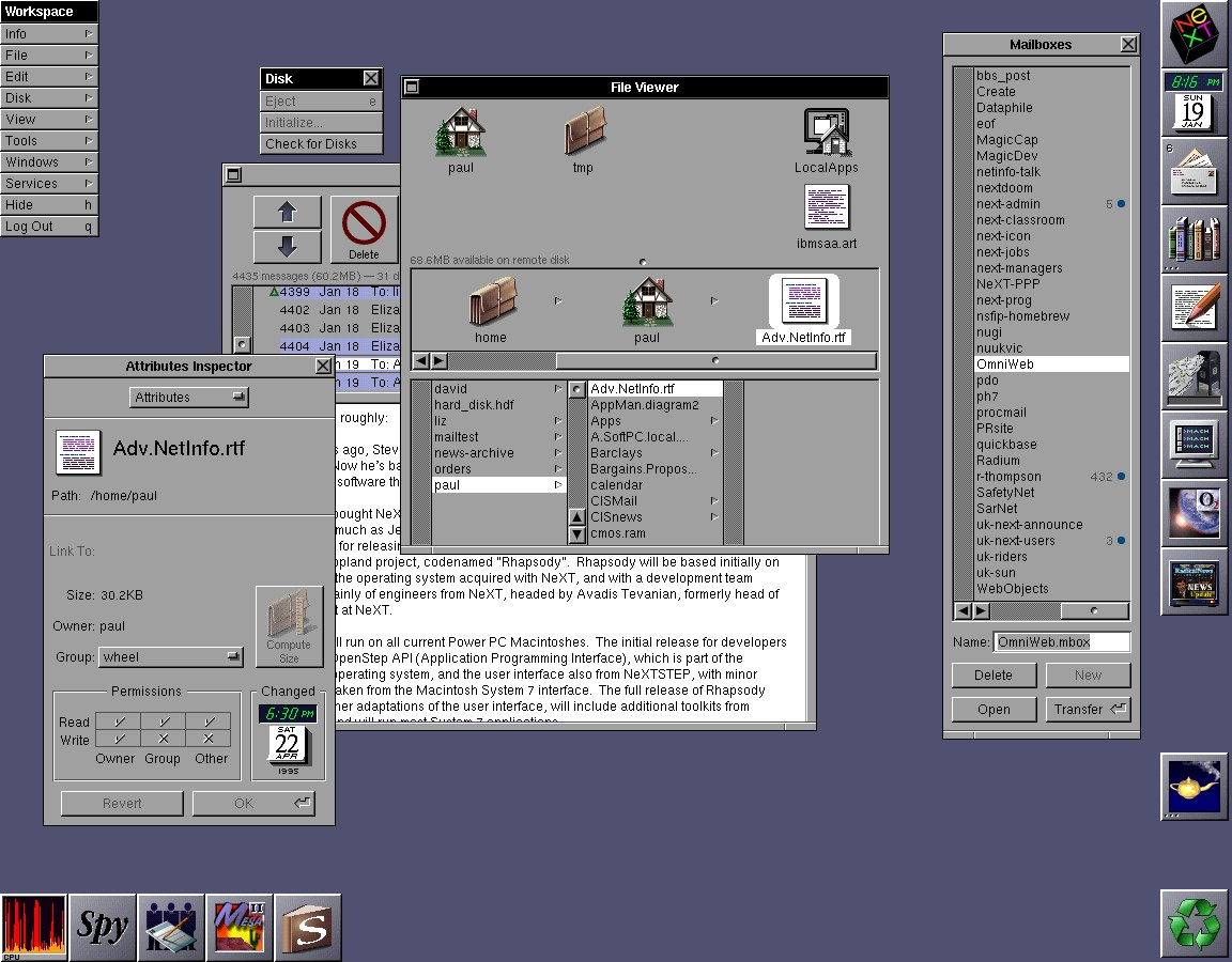
Sorry for the late response. The biggest difference to my eyes is the color choices. Although this was many years ago, I recall that the nextstep color scheme was very muted, tending to scale of grays rather than contrasting colors. The wikipedia screenshot seems to confirm my memory.
The nextspace screenshot shows apps and icons with very bright colors. Nowadays icons and apps tend to be colorful, and since they follow different color schemes, a collection of them has a high probability of clashing (e.g. the gray Gimp next to the orange Firefox.)
Nextstep could maintain a consistent aesthetic, I think, because: 1) there were not many apps available on it as there are now on nextspace, and 2) a single company, which had a notoriously style conscious CEO, produced these apps. Nowadays, apps are produced by different groups, with different tastes (let alone skills) in designs.
Nextspace faces the problem of maintaining the muted and clean style of nextstep, in a more diversified world. That's what I was reacting to.
Re:Nextspace – NeXTSTEP-like desktop environment for Linux
on Monday September 17, 2018 @07:44AM (#18004934)
Compare the nextspace screenshot to the nextstep screenshot, and one can see they are appreciably different.
nextspace: https://raw.githubusercontent.com/trunkmaster/nextspace/mast...

nextstep: https://upload.wikimedia.org/wikipedia/en/1/1d/NeXTSTEP_desk...
Re:The Booming Japanese Rent-A-Friend Business
on Thursday November 09, 2017 @05:17PM (#15666275)
Link is provided in the article. Am also surprised that the actor allowed his photo to appear. In fact, the website, which is in Japanese, has many photos. I wonder if they are of employees who work there. That would seem counterproductive.
Re:Dynamic Progamming: First Principles
on Wednesday October 25, 2017 @02:08AM (#15547885)
Please note, the last name of the author referenced in the article is "Trick", not Tick.