It's supposed to be a climactic snippet of a punchline without the set up, presented significantly earlier in the article than it's actual inline appearance, so that the reader has a hard time finding it in the normal scale wall-of-text, and can't skim to it. Then the time they spend sifting through the article, they read more of it, and (if it's a good article) they become more enticed into buying the magazine, as the newstand clerk scowls at them, because what is this? A library? No reading!
  But damn it! I need to know the whole joke!
  I guess I'll just buy it an read the rest on the train...
I actually definitely agree with you: that pull quote in particular added no value and I've removed it.
We've had this debate internally (I'm personally not a fan of pull quotes), but a lot of writers like them for the ability to highlight key points and to break up the stories.
Would it maybe be helpful if we didn't make the pull quotes full width? Or required that they be shorter?
It doesn't help that because of the size and margin you actually need to scroll past it rather than it being a more subtle part of the text.
Something like this:
https://blogs.adobe.com/cantrell/files/2012/07/pullquote_reg...

Likely wouldn't bug me because it is impossible (given the context) to assume you're meant to read it. Whereas when you stick it inline but make it bigger it could be either read or not read depending on the author's intent.
This too looks better:
https://www.drupal.org/files/images/better-pullquote-example...
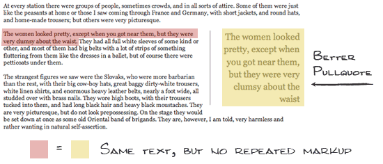
Not inline also and easy to ignore (which might be "bad" depending on the intent of the pull quotes).
I suspect that apart from the uncontrollable desire to add something that is perceived to add some aesthetic value to the article, that there is some precedence to these enlarged excerpts actually resulting in increased readership. I don't have data to back this up, but I know that David Ogilvy regularly discussed his almost formulaic use of serifed bold headers, slightly smaller, bold subheaders, and images because they were shown to increase the readership of his advertisements.
My guess is that these are used for a similar reason.
In her defense, I guarantee she was told that they shouldn't at some point in her life. Every time an employer goes with social proof over qualifications, they implicitly tell the world exactly this.
https://i.imgur.com/aCAmbQ2.png
It is super annoying and adds no additional content by design. There's like four or five of these throughout the article.
As to the article most of the issues seem to revolve around a broken healthcare system (i.e. no public option, insurance through employers, unemployed pay more than employed, etc). Although the author does start to come across as a little entitled when she brought up her Harvard education and how people like her weren't meant to be in positions like this...
I liked the first 2/3 of the article, just the end is kind of irksome. Harvard, CEO pay, gender gap, etc none of this came across like the author likely intended. I bet she didn't customise her resume for "The Container Store" job and just forwarded her normal/writer one.