That is, perhaps, a good indication of the disconnect between how professionals trained in graphic design perceive something and how the vast majority of the public perceive it. Most people wish their handwriting looked as neat and legible as Comic Sans. It doesn't look like it was written by a twelve year old, it looks like unprofessional. Which is why people like it.
Many people, when they see something they wrote in a standard computer font, think that it looks wrong. It doesn't look like their words any more, it looks too cold, formal, impersonal, professional, machine-like. They don't want their words to look like something that has been reviewed by a series of editors, run by the legal department and then sent to the team of graphics artists for final layout.
Comic Sans looks warm, friendly, human, and informal.
Everything you list as aesthetic defects are exactly the characteristics that make Comic Sans successful.
[1] http://kinkeaddesigns.com/wp-content/uploads/2014/03/Comic-S...

Many nice humanist sans-serif faces communicate "friendly, human, informal" well in practically any setting, but okay, there are folks who absolutely must have something that indicates "handwriting" in order to be sufficiently informal. Several typefaces fit that bill--Comic Neue, Architect's Daughter, maybe Just Another Hand--but seem nicer to read (not quite the same as legibility).
So what if we don't care about those issues and we don't feel the tension?
A valid question that I can't answer well briefly.
It takes some training or practice to recognize many forms of beauty, such as that in paintings, film, or buildings. The more educated/practiced one is in such things, it seems, the more one is able to pick out beauty and its lack. This consciousness makes ugly things more painful, but this is probably outweighed by the increased pleasure of beautiful things. (The idea of training improving one's perceptions isn't in tension with some person-to-person & culture-to-culture variance in what's beautiful.)
Even without practice, certain kinds of beauty or visual tension (which btw is not always ugly, though usually is when not "resolved") probably affect you even if you're not aware of it. Such effects have been observed in the other media I mentioned, though I'm not sure if typefaces have been so studied. So even if you don't feel the tension, it may be there, and it would only rise to consciously perceived levels with long exposure. Obviously there's some theory and speculation involved, but many fundamental design principles do by & large work.
Finally, let's say you conclude that it's a waste of time to enhance your critical eye for typefaces, you don't believe there is unconscious tension, etc. This is reasonable! But even then, you could still—nearly effortlessly—pick typefaces that work for you and work for us when you're communicating with a broad audience.
Sure, but do you recognize a beauty that's actually there, or you merely recognize what you were taught to recognize? (e.g you respond with a Pavlovian reflex to things you were conditioned to see as beauty).
Beauty isn't "there" in the object to in the same way mass or volume is there; it's contingent on human perception. Beautiful things trigger similar effects in a huge variety of people, perhaps universally (though being attentive to conscious of those feelings doesn't come automatically). So it seems meaningful to discuss what's beautiful and what's not, though skepticism about any single individual's or culture's standards of beauty is warranted.
Why just pretend?
> Is beauty and visual harmony always a desired property?
No. But bad technical execution is usually an undesired property, no matter what tone I want to set with a certain typeface.
Do you mean to say that there is any substantial evidence to the contrary? If so, you should elaborate.
> No. But bad technical execution is usually an undesired property, no matter what tone I want to set with a certain typeface.
OK. Please let me know what exact technique is being executed badly and how. Just dropping "bad technical execution" out of nowhere without substantiating or explaining the claim in any way isn't a valid argument.
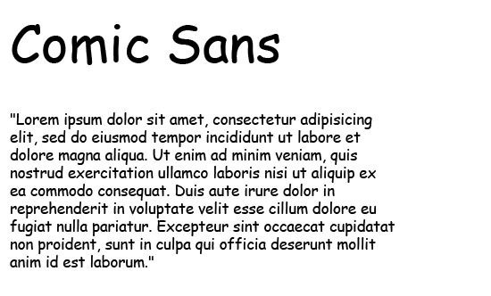
I don't believe that's the main problem at all. The problem is aesthetic[1]. Some letterforms are inherently unbalanced and create tension, notably the wild angles in the m, the serif in the s, and the tipping-over T. The wobbles in the I, n, and h distract as well. Beyond that, there are the subtler issues of different inclination on the verticals (j, t, l, h) and bad kerning for various character pairs.
If Comic Sans were truly convincing as handwritten font, it would probably be better; on the plus side it is sufficiently far from that that it avoids falling in the very bottom of a handwriting uncanny valley.
Now aesthetics doesn't necessarily impede legibility per se, but beauty and visual harmony are generally enjoyable, and use of Comic Sans eschews it. Compare it to the much better Comic Neue[2].
[1] example: http://kinkeaddesigns.com/wp-content/uploads/2014/03/Comic-S...
[2] http://comicneue.com/