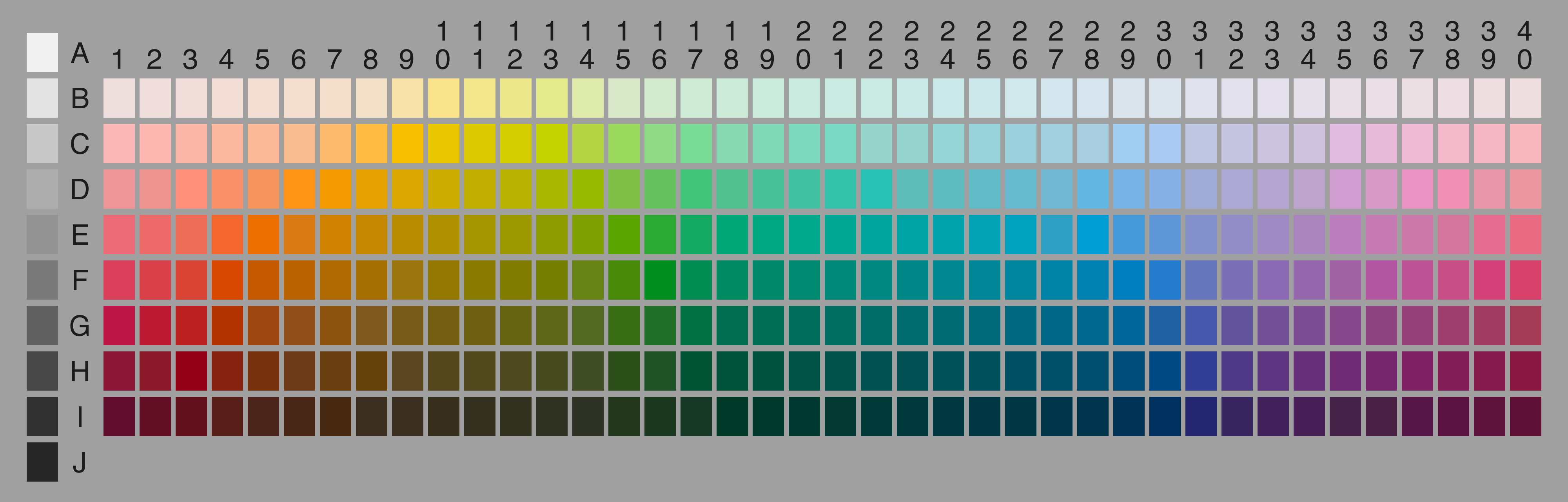
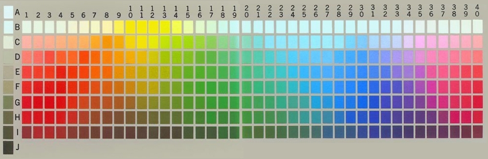
Woohoo! They’re using the image I rendered a few years ago of the world color survey chart (http://www.empiricalzeal.com/wp-content/uploads/2012/06/wcs-...), instead of the old photograph everyone used to use (http://www1.icsi.berkeley.edu/wcs/grid.jpg), which was extremely misleading.
http://www.wired.com/2012/06/the-crayola-fication-of-the-wor...
The crayola-fication of the world: How we gave colors names, and it messed with our brains, Aatish Bhatia, 6/5/12
It is a fascinating discussion of the origins of color words and how our perceptions are, well, colored by them. It also touches on the XKCD color map (search for "XCKD Color Survey Results"), another lovely insight into color names and perceptions.