News for hackers. Stuff that matters.

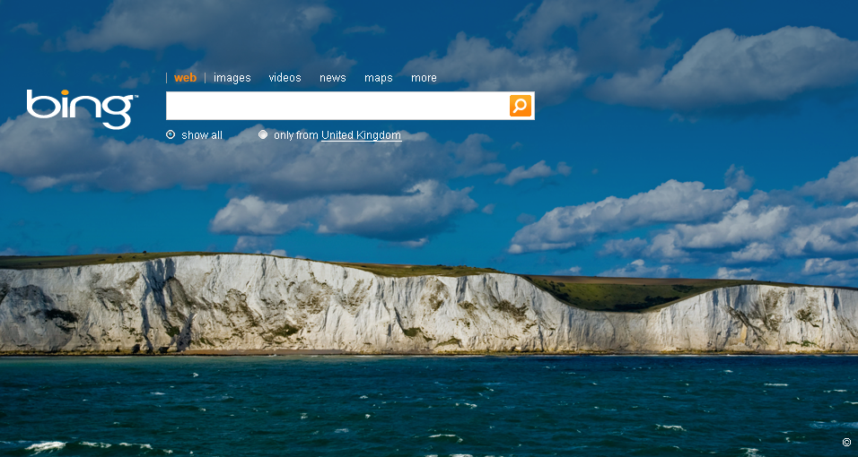
Bing--bad logo, over dramatic
http://www.sporkings.com/wp-content/uploads/2009/05/bing2.png

Why do they think we want a big, dramatic image as a background to our search page?

The logo is a good inasmuch as it departs from typical Microsoft logos, BUT it's still ugly.

Especially since it's not live, all we have are these 1st impressions. And frankly the design choices are lame. Will this have an impact on it's success?

( 4 comments | 2 points | on HN )
Re:Bing--bad logo, over dramatic by DLarsen on Thursday May 28, 2009 @03:23PM (#630871)
Why do they think we want a big, dramatic image as a background to our search page?

The logo is a good inasmuch as it departs from typical Microsoft logos, BUT it's still ugly.

Especially since it's not live, all we have are these 1st impressions. And frankly the design choices are lame. Will this have an impact on it's success?

Re:Bing--bad logo, over dramatic by planck on Thursday May 28, 2009 @09:52PM (#631367)
Well, I like it. My wife would use it as well. Perhaps they're not targeting the Hacker News demographic?
Re:Bing--bad logo, over dramatic by michael_dorfman on Thursday May 28, 2009 @02:57PM (#630817)
Sorry, I don't get what you mean. How is the Bing logo "over dramatic"?
Re:Bing--bad logo, over dramatic by DLarsen on Thursday May 28, 2009 @03:22PM (#630869)
The logo isn't over dramatic. The lame full-screen pictures behind the initial search screen.