I have both an iPhone and Nexus 7, and I keep forgetting on N7 that sharing to Evernote doesn't require laborious app switching and cut and pasting. It's a very real, important piece of the puzzle that Apple hasn't even bothered trying to attempt.
Then there are a ton of stupid UI issues they have, like when I open a new tab in mobile Safari, I don't want it to gain focus.
I'd like to be able to update the software on it without needing to rearrange apps into the order I want them yet again, I don't have any idea if that is possible or not.
I suppose you could put Favourites as a folder on the home screen, but that would defeat the purpose since you're back to two taps for a call.
http://dribbble.s3.amazonaws.com/users/3331/screenshots/1108...
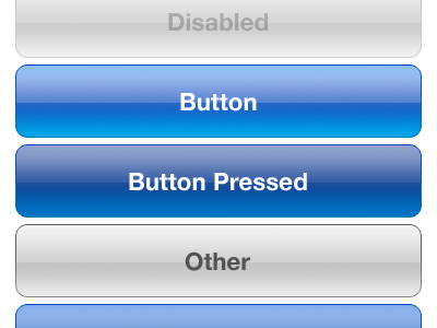
is getting old (OS X is even worse)
I'm not a visual designer so I'm not sure I'm entirely qualified to offer suggestions, but there are other button styles, even completely new ones that would work.
Some ideas:
How about some variation on the one in the upper right here?
http://www.colourbox.com/preview/2584456-712013-exit-beautif...

VST interfaces are usually choking with ideas
https://www.google.com/search?q=beautiful+buttons&hl=en&...
Or why buttons at all? I should just be able to interact with the direct metaphor of what I want.
Or a pop-up circular button system like in Palantir? http://www.palantir.com/wp-content/static/techblog/2007/08/s...

The interface looks like candy, instead of trying to outshiny the competition, maybe it should be matte? Then use shiny bits sparingly.
http://remodelista.com/img/sub/uimg/Janet_Images/suga-black-...

etc. etc. etc.
Let's not go for shiny kitsch, let's go for expensive sports car with a matte paint job.
Other than that, cross app communications (intents) and resolution independent layouts as an option would be nice and get Apple out of this weird resolution multiplier lock it seems to be trying to bust out of (with the exception of the iPhone 5).
How about other interface bits? There's a button and the screen, how about capacitive edges that can be used for interface sliders or other things? I love capacitive buttons on Android phones (when they had them).
Or let's get crazy, a completely disappearing product all together. Jam the guts into a watch, and a small wireless earpiece, or maybe ear/eyepiece and voice controls and a capacitive touch panel on the watch, don't make it look gaudy like Google Glass, get top eyewear designers to pump out different headpieces (lots of upsale potential there) etc. etc. and top watch designers to design the handpiece and turn computing into ubiquitous wearable fashion driven computing (with sales cycles as fast as the fashion industry -- seasons) and people will buy 4 sets of devices a year instead of one every two years.
> How about some variation on the one in the upper right here? http://www.colourbox.com/preview/2584456-712013-exit-beautif....
Yup, the 90's want their design inspiration back
The only cars I see with matte paint jobs are car modder's econoboxes, which look pretty kitsch.
Don't get me wrong, it's not that I think it can't be improved, because I can think of a few needed improvements myself. But I hear people continue to say this about Apple -- "They aren't innovating lately." -- without saying what needs to change.
So, without just comparing iOS1 vs. iOS6, what about the current state of iOS needs to change?