I couldn't quite formulate the exact reason why I disliked the Tahoe menus compared to previous versions, but this article nailed it.
The classic Windows menu from the article is a good example: https://tonsky.me/blog/tahoe-icons/[email protected]?t=1767611340
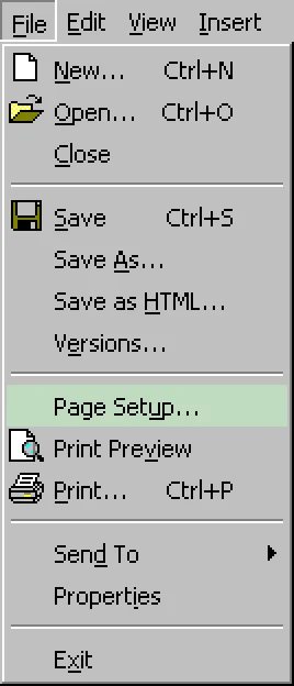
Though even the visual clutter of everything having icons I find faster to scan with my eyes on the first "visit", as those usually suggest the functionality I might be looking for at least. Even if not perfectly distinct, I find iconography faster to parse and guide me towards what I seek. I don't even particularly mind reused ones, as those usually mark a "section" of their own.
However I understand that some people would probably take no icons at all rather than every option having one... or whatever Apple decided to do in a given menu, considering Tahoe's inconsistency all over the place).
Starting to use Mac ~3 years ago, I often encountered giant blocks of text in right-click menus and while pleasing aesthetically, those were a chore to actually parse. For someone who daily drives macOS for, I assume, multiple years more than me, it probably comes down to memorisation, and how it looks becomes more important (with Tahoe breaking habits), but I find the inconsistencies and icons something that actually helps me find my ground.
Granted, the execution leaves a lot to be improved, I won't argue against it. Tahoe in some places feels downright amateurish. Despite that, I'll still take what Tahoe added over no icons at all... I feel like color icons + using them more sparingly would certainly be better though.
I guess a justification for Tahoe icons on my end is - those help me navigate the UI despite all their shortcomings (and ugliness they bring in many places).