This whole thread commentary is off point.
You: I don't understand, therfore I'm right
What kind of logic is this?
Its a non-falsifiable hypothesis.
I cannot prove you understand, if you don't.
I'm not here to hypothesize on why thats the case.
I'm not here to lecture you on art history
I'm not here to demonstrate digital image editing
I'm not here to make you understand
I'm here to share information for those that can put it to use.
If you have no need for this, just find another topic.
At a basic level, you don't have a very good understanding of this subject matter. You can admit that, or you can argue. Nobody cares.
Its useful for HN, though, to answer some of the questions you pose. Because, whether or not you are worthy or capable of understanding things, other people might be.
So, don't flatter yourself too much. I don't have the time to explain or reply to all the stupid shit in these posts. I've tried to skip over most of it and make lemonade out of lemons.
Example 1: Quantify the use of XYZ digital editing technique
The fact that you (1) asked this in the first place; and (2) attempt to use it as a "gotcha" to prove how smart you are is truly a great example of Irony.
How can one quantify these effects? I don't think a histogram will do it, since that's global. How can I use digital tools to determine whether these procedures have been used on an image?...What I see is the most direct interpretation and insubstantial modification of the source material. Could you direct me to what I'm missing?
Again, we need to rethink this...
Translation: And when I say "we" I mean "you" and when I say "re-think" I mean "think" of something useful to say.
So, consider I am not trying to answer your question.
Instead, I put forth a simple way for someone with the right skillset, to make some progress. If you fail, you fail. In essence, my only job I'm taking on her is to put a framework in place that migh be useful to someone that has the potential to understand, and the need.
If you don't understand this, no worries.
I think you may have overstated your case. Instead of letting it drop, you have dug in deeper and deeper, as if you could convince without evidence.
I'm not making a case. The images are "photoshopped". You asked to tell how to see artifacts of this. The way to do that is to compare and do an A/B test. I set that up for you. In 30 minutes I found a contemporary image to use. You're missing the point of why I did this.
The image is an obvious photoshop-orama. Its an award winning press photo. Exhibition quality. But--and this is important--its editorial quality. Than means, that its "interpretive" and true to scene. It could go in the NY times front page or whatever.
The point is this: So, even if they were exactly photoshopped exactly alike, they still are "objective" or whatever. If that's something important to you.
So, who cares if you want to make another one yourself? There are an infinite number of possible prints? You're not adding anything to the conversation. You're also skipping over that the digital scanning process. Which is not a neutral process. That nuetral image has been heavily edited. Atc etc....
The purpose is to understand this: We can make these images in photoshop. The original photgrapher could not. He could never see an sRGB colour output space, on an OLED calibrated LCD screen. None of those colours that went into 16 bit ProPhoto RGB and got moved all over the place, he would have never seen. The N-space images of gursky he could never have imagined. The localized N-space sharpening and color contraste every rookie with photoshop does, he could never have imagined. Simple, stupid shit that is in every WorldPressPhotoIntenatinoal photo, he would have never even imaginged, much less ever saw. Is that good or bad? Neither. It just is the way it is.
His images would have been made in a colour space available to him in 1910. His colour-filtered lanterns would define the colors he saw. It was likely a modest colour space, but I have no idea how efficient his gels were. Etc. and to be honest, I sort of don't care. It would have been cool as shit, for him. As history, its genius that he made the seperations.
But, lifelike or not. The stuff on that webpage, the stuff HB is/was commenting on, what modern photoshop. Its art, but its a different medium. I won't tell you if that is good or bad. But its different, that's for sure. Its not really a debate. Its not like kodachrome or whatever. Its a different ballgame.
The only purpose of this sub-thread was to note this as a relevant consideration. And furthermore, to explain some of this to intellectually interested HN readers. 99.99 percent of the world might be clueless to this. I'm still sorta surprised that the HN crowd may or may not be any better.
The fact is, the images were made in the color space of nature. The limitation was precisely the latitude of the plates when exposed to light which had been band-pass filtered to allow red, green and blue light to pass. What the precise details of those filters and the respective sensitivity of the plates to those spectra are, I can't say. Obviously it was panchromatic or we wouldn't have a red channel.
Here's an image which shows how snugly the sRGB color space fits within the real of visual perception. https://en.wikipedia.org/wiki/File:Colorspace.png

It sure is cozy in there.
What we have in front of us is still an approximation of the colors of nature and that we can perceive.
Here's some samples of fluorescent paint
http://www.goldenpaints.com/products/color/fluorescent/fluor...
Now I don't know anything the history of fluorescent paint and whether it was around in Prokudin-Gorksy's lifetime. But I know for certain he could have seen it if it had and noticed its intensity.
I hope you notice that the photographs of the paint on the website are not themselves fluorescent. This is because we can perceive colors that the screen can't show, even if you have the latest Cinema Display.
Also, go online and look up some gold or copper. Then look at the real thing. Good luck getting the computer to produce that color.
Fact is, producing these colors is hard, and done with spot color when printing. That doesn't make it outside the realm of perception.
What you're basically arguing is that the film couldn't have possibly captured the colors we see here, and that they were invented by the restoration process.
So, I'll ask again for quantification. This is the digital realm we're discussing. What I'm not asking for is the quantification of taste or feeling, or even of perception, in spite of this discussion. There are so hard numbers underneath all of this. It would be interesting to see a side-by-side comparison of the same image with the pixels that are impossible in this alleged early 20th century color space highlighted.
However, I think you've successfully moved the goalposts past what we are capable of knowing directly. By alleging that these 16-bit TIFF grayscale images created in the scanning process are themselves heavily manipulated, we have come to a stopping point. There's no way I can get my hands on the originals in order to ascertain whether you are correct. (However note that the images were scanned is grayscale, perhaps using sGray as the color model, is it the fact that you also assert that sGray contains more colors than Prokudin-Gorksy could have perceived or captured on his plates?)
Aside from your clever dismissal of the "original" as far as we are able to obtain it, the 16-bit color-separated TIFFs, is it possible at all to bring these images into a computer and respect their original "limited" nature and bring that presentation to a computer screen? Because if it is not, then what is the point?
Your assertion that we are in love with Photoshop, not the work itself is basically moot. What you are offering up as an explanation of the compelling content of the work is in fact so commonplace as to encompass all of digital media. The powers granted Photoshop in this discussion to smudge the original color working space into realms impossible in the original are in fact so pervasive that to draw them out in this discussion is merely an excuse to talk about your pet theories about digital media and have nothing whatever to do with this work under discussion.
So, its safe to say you are a Troll.
But, for the faithful HN reader:
To sum: [a] digital data is recorded in a non-linear function vs perception by the mind. [1] digital scan translation thus make it 'visible', based on a variety of adjustment parameters. [2] each input and output device has its own gamut, or sub-space of EMR. [3] translation through each device results in multiple renderings. [0] The capture medium was positive monochrome stills, in three parts. It follows that there is no color information in the tonal maps. [4] Tonal density variances provide the only color information that survives. But, absent the original filters, all presented information is inferred. [b] all output devices have gamuts, and are subsets of the visible spectrum. We lose information at capture and at output. [c] the purpose of image processing is to ensure as much information survives, in its most usable form. [d] a/b output testing ensures presented information is accretive to its base image, otherwise such an output would be rejected.
[Troll]
[I simply asked for an objective demonstration...] Of differential perception. Nice straw-man. If you want this, you a/b test. no unicorns will be forthcoming.
[made the color space of nature] Note: color space is a sub-set of EMR by definition.
[The limitation was precisely the latitude of the plates] The plates have two limitations you fail to appreciate: they are positive images and they are monochrome.
[Here's some samples of fluorescent paint] - WTF, no need thanks.
[What you're basically arguing is that the film couldn't have possibly captured the colors we see here] - film wasn't used, this is a straw-man, and irrelevant.
[So, I'll ask again for quantification. ] As a general concept, you quantify data with numbers. If I tell you [x,y] pixel N of 12.1 million went from [221,112,216] to [221,112,217] what then?. The impact on perception is non-linear and context deponent, to adjacent values (color in particular). This has as much relevance as reading Binary computer code.
[It would be interesting to see ... the pixels that are impossible] -- non-sensical formulation. That said, in a literal sense, each pixel that is tonal mapped was not visible in the original. because of the scanning process, there are no original tones. but even assuming that away, the www jpegs are tonally altered independent of color. You can difference these in photoshop. Heres how: take the scan 3-layer monochrome>flatten, align, crop and resize to match the online web jpeg. put both layers in a new file. confirm alignment. add BW layer the color Jpeg image. and difference. the "scan" from the "www". and there you go. a BW difference layer. all color is PS of course. But this yields no information, because of the non-linear impact of tonal variation deltas on image perception.
[I hope you notice that the photographs of the paint on the website are not themselves fluorescent.] I think this shows output gamut is a sub-set of visible light. see above.
[So, I'll ask again for quantification. This is the digital realm we're discussing. What I'm not asking for is the quantification of taste or feeling, or even of perception, in spite of this discussion. ] Again, this dishonest. You areasking for a quantification on the impact of perception. Or you're just fishing for something, so then you can say "this data you gave me is worthless"! All other meanings of the data are worthless. We've established this above, [x,y,z] deltas are like [0.1] binary information. But, that's so obvious I only mention it here for humor. =D
[I think you've successfully moved the goalposts past what we are capable of knowing directly. By alleging that these 16-bit TIFF grayscale images created in the scanning process are themselves heavily manipulated] Nobody moved the goal-post. You just don't know what game you are playing. All digital scans alter the image, nothing you can do. the scanner has a gamut. and the digital data and the perceptual data are non-linear. so there needs to be math added. That math has control parameters, set by the artist using PS.
[There's no way I can get my hands on the originals in order to ascertain whether you are correct.] You can get your hands on the plates. But, then you cannot make even the most basic adjustments, because the tones are fixed on glass. So the output image quality is limited like slide film. The blown out sky highlights are a classic example of non-recoverable detail for the viewer using a one-step process.
[Aside from your clever dismissal of the "original" as far as we are able to obtain it, the 16-bit color-separated TIFFs] No. you can obtain the plates. But you can never make any adjustments to this data, because there is no secondary image development. So, the limits of the emulsion are the limits of perception. The sky detail is nearly invisible on the glass (all 3 layers) plate and prominent in the www image. This single counter-example is definitive.
[Is it possible at all to bring these images into a computer and respect their original "limited" nature and bring that presentation to a computer screen?] The world press photo winner is editorial, so it meets your test of respecting its subject. But again -- it is very, powerfully modified -- another counter example to your basic premise. Dichotomy between trivial originality or unfaithful distortion is false.
[Your assertion that we are in love with Photoshop, not the work itself is basically moot.] Nice straw-man. you are looking at photoshops, not glass plates. The other straw man is the notion of [work itself]. There is as much art in the secondary process as the capture, in particular with these images.
[You are offering up ... an explanation ...to encompass all of digital media.] All the omitted words were yours. Its nothing special, digital media. It is powerful in the right hands. But then again, so was oil based paint for Da Vinci. It is a medium. And you need to appreciate and understand it. Dichotomy between trivial originality or unfaithful distortion is false in painting too.
[The powers granted Photoshop ... are in fact so pervasive that to draw them out in this discussion is merely an excuse to talk about your pet theories about digital media] You continue to think there is a level playing field. You may like It or not, my expertise in these matters need not be questioned. See opp cit Michael Fried for Academic background, if you must rely on the others too.
http://lcweb2.loc.gov/service/pnp/prok/01600/01676v.jpg

do you know why it appears at the bottom and not the other two frames?
here is what I would call an uneditorialized composition of the image you linked
http://www.loc.gov/pictures/resource/prokc.21676/?co=prok
..........
Now, take a look at this image from Prokudin-Gorsky [as per the linked HN article]
http://inapcache.boston.com/universal/site_graphics/blogs/bi...
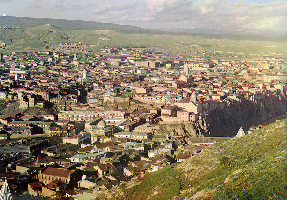
...........
And Here: you can talk to yourself (again) as a control
I took the time to download and produce my own take on this image. Linked here:
Though I do find the "uneditorialized" version to have a greenish cast that if I were working in an old-school darkroom, I would have attempted to fix. Also I would have dodged the sky in order to bring out the cloud details. Though I admittedly don't have much experience doing such things in a darkroom for color photography, and I suspect that it's harder than for black & white.
Since you don't seem to actually wish to state any thesis on your own, perhaps you'll answer a question:
Which of these of these images, the "uneditorialized" or the Photoshopped version is a more accurate representation of reality, as seen by Prokudin-Gorsky's eyes on that day?
re: A more accurate representation of reality
Images have information and utility. Keeping this in mind, you can avoid the notion of accurate/inaacurate and real/unreal and make deeper progress in terms of understanding how images are made and how they are used.
....... [this is from review of Hyman, 2006 opp cit]
“The longer you work, the more the mystery deepens of what appearance is, or how what is called appearance can be made in another medium."—Francis Bacon, painter
This, in a nutshell, is the central problem in the theory of art. It has fascinated philosophers from Plato to Wittgenstein. And it fascinates artists and art historians, who have always drawn extensively on philosophical ideas about language and representation, and on ideas about vision and the visible world that have deep philosophical roots.
John Hyman’s The Objective Eye is a radical treatment of this problem, deeply informed by the history of philosophy and science, but entirely fresh. The questions tackled here are fundamental ones: Is our experience of color an illusion? How does the metaphysical status of colors differ from that of shapes? What is the difference between a picture and a written text? Why are some pictures said to be more realistic than others? Is it because they are especially truthful or, on the contrary, because they deceive the eye?
The Objective Eye explores the fundamental concepts we use constantly in our most innocent thoughts and conversations about art, as well as in the most sophisticated art theory. The book progresses from pure philosophy to applied philosophy and ranges from the metaphysics of color to Renaissance perspective, from anatomy in ancient Greece to impressionism in nineteenth-century France. Philosophers, art historians, and students of the arts will find The Objective Eye challenging and absorbing.
.......
I hope this helps.
If you fall into the Continental camp of thought, then that explains why you are so hard to pin down. Continental thought is rife with meaningless hot air. Here's piece of evidence for that assertion, just in case you doubt it:
http://en.wikipedia.org/wiki/Sokal_affair
If you do fall into the Continental camp, you surely are not to blame. I blame society. On the other hand, it's never too late to replan your route to a saner road.
Also, Like Nietzche, I don't always write to be understood, at least noy just by just anyone. You may need to do some work or have some training. But to those that know, it will make sense.
As a sidebar example: accurate/innacurate.
Think about this at the pixel level. It already is innacurate (its a square). Or with Jpeg compression, its also deleting information and replacing it (less accurate--like areas of information are simplified). And then, at another leve of abstraction consider something like this: http://en.wikipedia.org/wiki/Unsharp_masking. You should read this, but the tl;dr is I can make an image "sharp" by ~blurring it. So, is that "more accurate" (can see it clear) or less accrurate (its more blurry?). I've just lost data. But I gained contrast. Wait, what?
So, there is a problem in continuing the discussion at this level without alot more work. Its a practical problem as well. One just need different mental frameworks to progress. Its just that simple. At the end, only then, can you come back and have a better understanding of "accurate" etc. But don't take my word for it -- that book is really good--and touches on all of this. And it is Rigorous. He's an Oxford man. Etc.
Of course, there is a reason it is a book and not a Hacker News Thread. =D
These images are no less impressive without a color balance provided by the editor. They are a journey through the former Russian empire and down the old Silk Road into a past made more accessible by color. Beyond any concerns of the trueness of their rendition, they are a readily comprehended document of a world long gone. These are relics in living color, their faces and fascades as ruddy as the day they were photographed. This is a far-flung agrarian empire and the ancestors of an antique world on the cusp of an upheaval.
Whatever the realities of the world represented and the facts that fill in my poor command of history, this is a world that integrates itself squarely with our everyday world precisely because it is depicted in a familiar fashion. The commonplace monochrome images of the past are colder, more analytical, and more removed than these.
So, aside from the interests of archivalists and historians who need to preserve artifacts as completely as they are found, who gives a damn if the use of Photoshop munged the color space a little and these images are dressed up a bit for eyes who've seen every color? The dressing doesn't alter the substance beneath, and if we are able to see past the process with a little help from the editor and into our imagination of this other world, all the better.
In a more sober assessment, all of these colors in these scenes can be constructed from the world in which we live currently, the grass, the sky, the skin tones, the wood, the stone, the dye in the clothing. The lighting conditions can be replicated for the same time of year, day and weather conditions. All of these sites exist in the world, however excavated or built up. Clothing can be sewn and dyed, models found and dressed. Only then may we know if what we've seen here isn't a very slight fabrication by the editor.
Or we may be assured that what we've seen is good enough and close enough that we had wrung out from it the last drop of evidence of the human condition, and let it rest.
http://www.loc.gov/pictures/resource/prokc.21676/?co=prok
As anyone can tell, this one has undergone a transformation, colors are corrected, blemishes have been cloned out, and there's some gradient masking at the top to knock down the difference in brightness at the top of the scene.
http://inapcache.boston.com/universal/site_graphics/blogs/bi...
If anything, the version on loc.gov has more vibrant color, tending a little toward the blue. The shadows are open, and as you'd expect from three color plates on monochrome stock, the dynamic range is enormous, sunlight sky and clouds at the top and deep shadows rendered in detail.
Have a look at the original scans here: There's plenty of shadow detail present in the original.
Really, you should download the 16-bit 69.1MB TIFF image, and
not rely on the JPG for details, I'm just linking it for convenience.
Here's where you can download hi-res version. http://www.loc.gov/pictures/collection/prok/item/prk20000011...
I took the time to download and produce my own take on this image. Linked here: http://imgur.com/wHWmu
Here's the thing, had I remembered how to paste into a color channel this whole process would have taken 15 minutes. Instead it took me 30 after I had downloaded the image. With no scripts or otherwise head start, I pasted each image into its own layer, auto-aligned the layers, and pasted them into a new image on the respective color layers. I then used an adjustment layer with a gradient mask to add some contrast to the sky. Saved as a second 16-bit TIFF and pulled that into Camera Raw. Here I added a little sharpness (accutance), pulled the noise reduction slider over a bit. I brought up the brightness about 1 stop and used highlight recovery to bring in the highlights. I did not pull up the shadows. I did not enhance the clarity, or add additional contrast. I did not pull up the blacks. I did not color balance at all. I did not touch the color sliders. So no, I'm not a Photoshop genius, I don't do this work professionally. This is amateur stuff, which accords with my statement of the level of manipulation done on these photos under discussion. This isn't gross, wholesale changes to the image in the way we're all familiar happens in fashion photography. I wouldn't even go the other way, to say this is subtle image manipulation. It's as intellectually honest as cropping without altering content, printing on contrasty paper, dodging and burning. So, please tell me how my image differs significantly from the one linked on the Big Picture, and which you'll find linked
also from the loc.gov page.
Finally, a response to your "points" 1 through 9.
1) "overall tone, color, and contrast nearly the same" Are we even looking at the same two images? One image taken on a completely overcast day, there's fog on the far right too. The other, bright full sunlight, within 2 hours either side of local noon.
2) grass and rock have a distinct tendency to look the same
3) How can you possibly say the shadows aren't present the Prokudin-Gorsky image? It's a sunny day, the sun is high in the sky, the buildings are shrouded in shadow. It's only due to the extreme latitude of three monochrome images combined that we're able to see this in a color slide. An of course, how in the world can there be shadows on an overcast day, in the mountains? What can one expect with a huge horizon-to-horizon dome of diffuse light overhead? I'm not entirely certain the photographer didn't use a strobe in this photo, but the shadows are completely plugged up, and I'd expect to see some catchlights in the people's eyes and the dark cloth to have a bit of a sheen to it. No these two images aren't even remotely the same.
4) You say they look identical, but how? Yes, I suppose on an occluded dark hillside, they can walk out from under the cloud and down into the sunny valley below.
5) Like I may have mentioned, histograms prove nothing about the local contrast situation you're pointing out. But whatever the case, your response is filled with subjectives. I should have been more specific. I would have liked your ideas on objective ways of quantifying this modern photographic look you feel is the key to our visceral reaction to Prokudin-Gorksy's work. Because if digital tools have put it there, there is a way to extract that information.
6) sounds like an interesting article
7) this is good info, it made finding the source image much easier
7 1/2) no, they aren't interchangeable at all. In fact, much of what they have in common is the fact they were photographed on earth, and that human beings with their particular sensitivity to light are viewing them.
8) I don't have any sense of nostalgia with either of these photos, so perhaps that's just you. If there's a color cast in the Prokudin-Gorsky photos, I wouldn't be surprised. Who knows how balanced his color filters were, how accurate his shutter timing was, or how must the exposure compensation differed between the color filters. Any of these factors can shift the color balance. In the more recent photo. I assume the murkiness comes from the scene, the deepness of the blacks, and the lack of the warmth of sunlight. But again, so what if the photographer had stuck a cooling filter in front of the lens, or done the digital equivalent. Is altering the mood of the scene with light allowed?
9) That's a real party trick. two images in monochrome, more alike because their color differences have been discarded. But they are still different enough. I can't help but notice how soft the portrait is, but maybe it's just the JPG image and its size, the people seem flat against the background. There's not a lot of contrast in the scene, but like I pointed out before, it's a trend to enhance local contrast. You can see this distinctly in the faces where the cheeks and foreheads seem to pop out. What pops out in Prokudin-Gorksy which shouldn't?
re: footnote #1, when a restoration takes a long time, we cannot assume it because layers of dishonesty are being heaped on. I can easily see spending hours on each photo. There are plenty of blemishes, and some of the emulsion has come off the plates, which would require reconstruction from scratch. It is painstaking work for the sake of accuracy. As far as I know the Library of Congress mission is the archival of historic artifacts and not the production of emotionally manipulative imagery. They may even err on the side of cold hard facts. You can see the bottom left corner in my image. Notice how one of the color channels is missing. My guess is that was reconstructed from the imagination. That's why you see it in the other images. How long does that take, to pull in the image from the other channel and colorize it appropriately?
Ultimately, the restoration of the Prokudin-Gorksy images is not a tour-de-force of Photoshop. It is not the implantation of faddish notions of color and contrast on a historic process. No subtle tricks to fool the unwary gazer were employed.
I think you may have overstated your case. Instead of letting it drop, you have dug in deeper and deeper, as if you could convince without evidence.
*Edit: typos, addition of a sentence or two, and fixed the ugliness caused by pasting from notepad.