Great comment about font design in general, although in this particular article it seems like it's not fallacious at all. They seem like they're explicitly going for a handwritten effect, and are willing to sacrifice legibility to get it. The images at the bottom of the page achieve a hand-made look, and having the letters look like they were drawn with a brush or pen -- including all the flaws that come with that -- is part of the (quite impressive, IMO) effect.
Re:Generating the Alphabet
by wanderingstan on Friday March 15, 2024 @02:18PM
(#39718958)
As a sometimes semi-professional calligrapher, I can also add that the mark of good calligraphy is also to move beyond mere motions of an oblique pen held at a constant angle. Really beautiful and pleasing shapes demand precise control of angle, tilt, and ink flow all at once.
Beginner: http://2.bp.blogspot.com/-dJuDu0cbH9c/UPXOvYUczGI/AAAAAAAAAq...
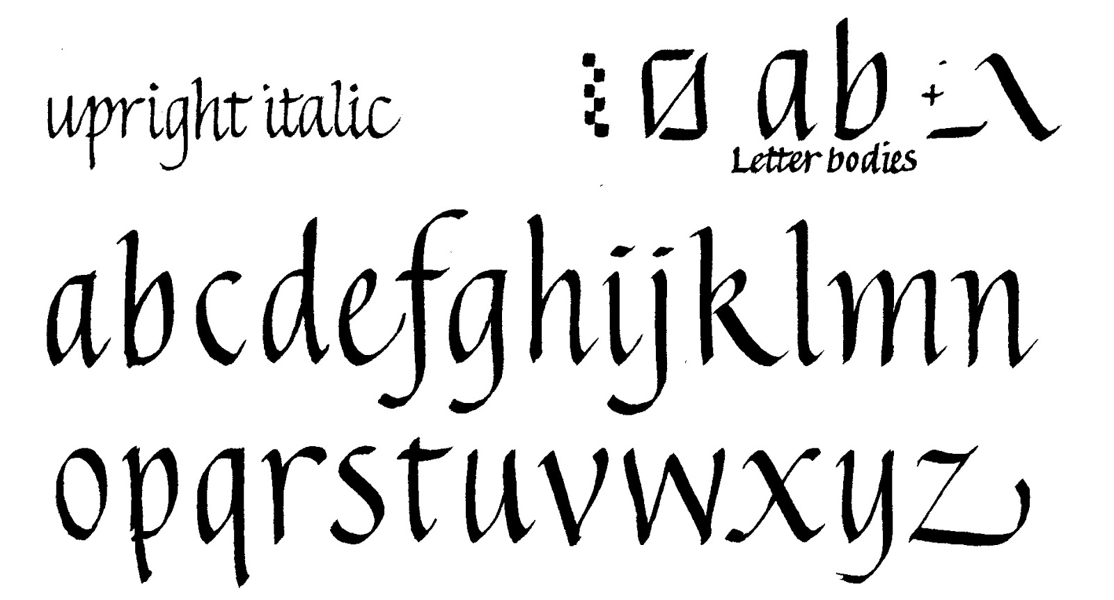
Advanced: https://i.pinimg.com/originals/c7/34/e8/c734e8ec3c19be54192d...

"Additionally, I don’t want a visual element of the project to be something I didn’t create myself."
Like many other approaches to font design it falls for what I like to call the "Metafont Fallacy".
When we approach the shapes of a typeface it is very natural to think of them as created by a writing implement like a brush or a pen. That is how characters were reified for the better part of 5000 years after all. Even the Romans used pen and ink despite being better known for carving into stone.
It is no surprise that Knuth designed Metafont as simulation of pen and brush.
It turned out, however, to be completely impractical to produce a typeface that looks similar to what we are used to. Similarity is crucial for legibility.
The reason for this is, that the stroke width of any contemporary typeface varies in a much more complex way than can be produced by an oblique pen. There are at least three causes for that:
- Printed letterforms have never been produced by a pen or brush
- Letterforms include sophisticated optical corrections
- Letterforms account for the flow of ink in the printing process, also known as ink traps
This is why most real Metafont fonts do not use all the polished pen and brush machinery at all, but use a very thin pen to draw the complex outline and then fill it.
Modern letter shapes are just like that and nothing that pen and brush strokes could directly reproduce.