Your comment reminded me of this excellent article from an IBM researcher:
"Why Should Engineers and Scientists Be Worried About Color?" http://www.research.ibm.com/people/l/lloydt/color/color.HTM
Some very excellent examples of how using a different set of colors in your heatmap has a huge impact on how it's perceived.
GazeHawk intern here. These are really good points. We're aware that heatmaps can be problematic and we think about tweaking the way we build them quite a bit. Maybe in a few blog posts time you'll notice that we're using a different-looking visualization. I've put that IBM study into our "food for thought" reading list.
You should, because I was wondering why experienced redditors seemed to be fixated on blank space according to this image: http://www.gazehawk.com/blog/wp-content/uploads/2011/07/redd...
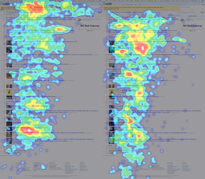
...The two red hot-spots to the right and further down the page.
Is it an emergent distortion because of the heat map? Is it an aggregate spot between the link above and the link below that ends up being significant? Do experienced redditors rest their eyes on blank patches of the page??
It's the heatmap. The threshold between red and white in the heatmap appears to be more meaningful than it actually is.
The only good use for them I can think of is if the graph is on a log-scale and the changes in color represent orders of magnitude difference. For a simple heatmap though it'd be much better to just have a smooth gradient between two colors.
Sorry to nit, the article was interesting. That's just a peeve of mine.