https://cdn.q-dance.com/l6hfsc63q612/6q72WINFR6Elorje1a49Nt/...
1. https://i.pinimg.com/originals/85/21/c9/8521c9f0eefb09245edf...

But others letters are made the same way, a bit like the font in the article. So, less creepy, I guess.
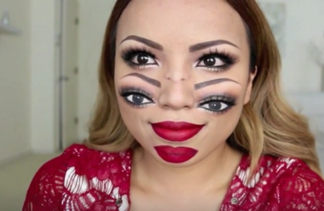
It has the same vibe than this novelty facemask, if you wore several of them: http://www.naijanetwork.com/uploads/imageupload/997/FLM4TP8P...
If you could put the word "caterpillar" in a cocoon and hatch a real butterfly from it, these letters are what it would look like if someone cut the cocoon open too early.
The letters are deeply rooted in our interpretation of the world, so when those symbols are distorted, it is a distortion of the whole world itself. I bet it's mostly only native users of the alphabet who are affected like this. Someone who uses it as a second language, e.g. a japanese person, probably doesn't get the same feeling
https://www.archdaily.com/782889/flower-plus-kindergarten-oa...
Maybe it's linked to trypophobia.
IDK if it caused prior knowledge that there will be something "unsettling" I got from HN title ("Unsettling capital letters"; impossible to rule out now). I'm pretty sure it induced similarly disturbing feelings I got when I saw photos of bones affected by cancer for the first time. (Do not search for them, or be warned; I normally have no problems with such imagery, but this particular views haunts me to this days and I'd better like to have never seen them.)
According to sleep research, you have to dream of those to lessen the emotional load associated with them, so go and have a couple of bone cancer nightmares.
Frank Lloyd Wright's lettering (apropos since we live a couple miles from his home/studio in Oak Park), incidentally often doubled or tripled the crossbars on A and H (but not, I would note, E). Being in FLW territory, we see a lot of the Eaglefeather typeface based on his lettering [0] but I doubt that my son was inspired by that (but then again, since he was three, he has declared his intention to become and architect).
As the alphabet develops in the replies, it loses some of the creepiness and gains something else. Not friendliness exactly, but.... not sure. Something.
I think the first ladder E is creepy partly because it's unexpected, and is placed among normal letters. It's a cuckoo, an interloper, alien.
Others have pointed out similarities with some machine learning outputs. I was reminded of the spooky, spidery lettering from fashion GANs, e.g. check out what happens to the text "bisou" and "100% love machine" in [0] taken from [1].
[0] https://images.deepai.org/converted-papers/2007.10947/figure...
[1] https://deepai.org/publication/garment-design-with-generativ...