Ligatures in coding fonts are a poor workaround for bad keyboard layouts. If you want to see ≠ then type ≠.
Julia is the only ‘major’ language I know that supports most such characters.
[1] https://wiki.haskell.org/Unicode-symbols [2] https://4.bp.blogspot.com/_EKfCI8QuAaM/S7L-baZ-ZVI/AAAAAAAAD...
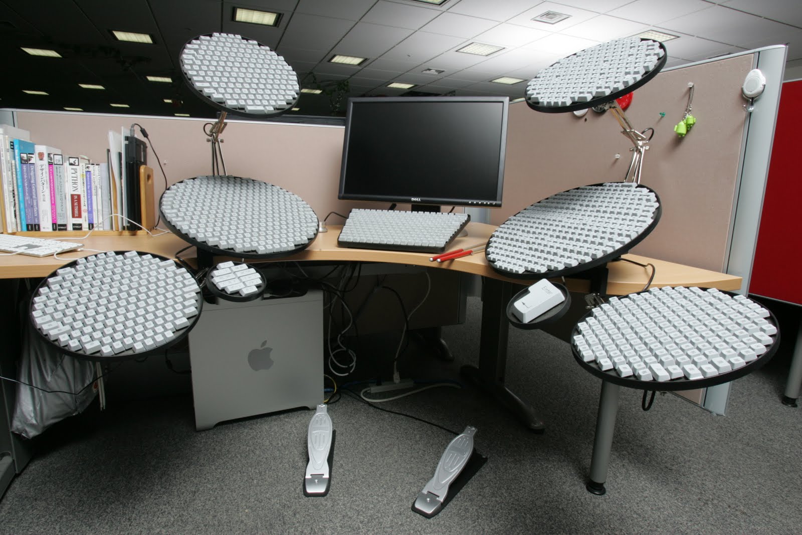
OS X is probably the best overall, with easy installation (with one gotcha for development) and SIL Ukelele being a decent editor.
XKB is tolerable, overcomplicated in some ways and limited in others (really needing a layout to be paired with an .XCompose), but Linux Desktops™ make it painful to configure any layout that doesn't ship with their system.
Pre-deprecation, there were formatters which would replace the two characters with the single unicode character if you wanted. If you use a language which supports unicode function names and operator overloading, you could easily add support for your unicode comparison operators.
I feel the same way.
I do think I would enjoy programming in a language that used a slightly more extended set of real characters, as long as we had solid editor and font support so typing and viewing them wasn’t going to be an issue for anyone. For example, I’d like to finally have ≠, ≤ and ≥ lining up neatly with =, < and > in my code! I could imagine a few other carefully chosen and easily recognisable symbols, such as ∈ and true arrows, being helpful for readability as well.
But the world speaks in Unicode these days, so assuming there was adequate tool and font support, I think writing these characters for real would be much better than relying on ligatures. Even where ligatures are supported, they tend to use awkwardly wide glyphs to replace multi-character combinations so they don’t break alignment in a monospace font, and sometimes the fonts with programming ligatures seem to join certain combinations in bizarre ways just because they can, even when there’s no apparent need for it.