Re:An attempt to make a font look more handwritten
by nextaccountic on Sunday August 09, 2020 @06:20AM
(#24098573)
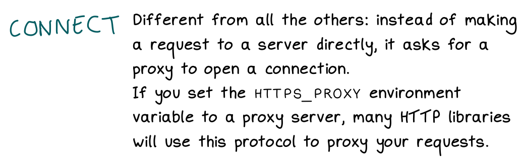
The "connect" in the first image is going upwards I think
Re:An attempt to make a font look more handwritten
by lodi on Monday August 10, 2020 @01:22PM
(#24111680)
"Connect" is a picture of his actual handwriting; the black text is the first version of the font.
Re:An attempt to make a font look more handwritten
by bilbopotter on Saturday August 08, 2020 @08:02PM
(#24096243)
+ the text isn't joined up.
- Direction of the text (we don't write exactly left to right, we strive for that but end up going slightly up or down, usually correcting the tilt of one word in the next as we notice the deviation).
- irregular spacing
- Some letters invade the others' space (the g's for example end up going a bit under the previous letter).
The combination of those three is, I think, what gives the artificial text the feeling of being a row of invisible boxes each filled with a character. Still, the result is extremely cool!