Wikipedia has an example of a street sign with "ſs": https://en.wikipedia.org/wiki/File:Waldstra%C3%9FePirna.JPG

And of course there are the street signs in Berlin which use a very weird ß, but it's still an ß as opposed to a "ſz" combination: https://en.wikipedia.org/wiki/File:Berliner_Stra%C3%9Fe.JPG

The font is both pleasing, readable, breathable, and has these nods to Germanic typographical heritage. It's really lovely. Among my favorite details pertaining to living in Berlin.
[0] https://www.xn--untergrund-blttle-2qb.ch/fotos/Strassenschil...
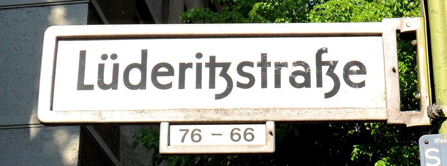
[1] https://live.staticflickr.com/3730/9668177465_bde765c591_h.j...

[2] https://fhxb-museum.de/xmap/media/S16/T1815/image/fhxb_jh_k0...

[3] https://upload.wikimedia.org/wikipedia/commons/thumb/d/d8/M%...

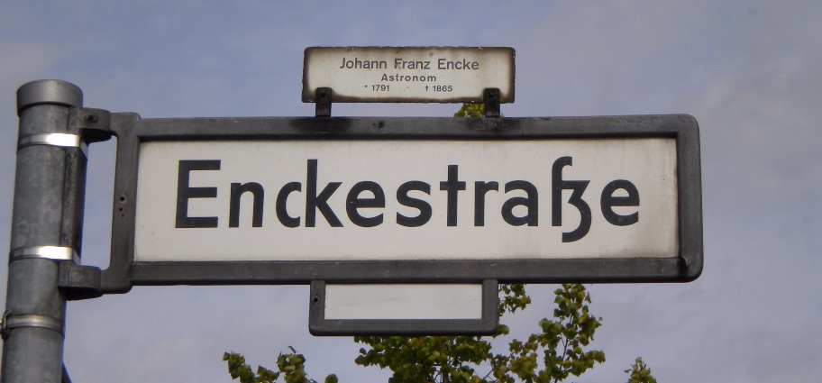
First off, it's strange that the German letter "ß", a ligature of two "S" forms, is named "Eszett", which is the letters "S" and "Z". This is because way back in Middle German, "sz" was the more common form. [0]
When moveable type was invented, Italian and Latin (and sometimes English) needed the "ſs" ligature, while only German needed the "ſz" ligature. Thus most typefaces only included the "ſs", so when printers needed to print German, they would substitute the readily available "ſs" for "ſz" rather than buy a new font. (This was further complicated by the dispute within Germany about whether to use Fraktur or Antiqua typefaces [1])
This practical economic decision led to the "ſs" ligature becoming standardized, turning into the modern letter "ß", but still called "Eszett"!
Berlin street signs are fascinating as they (alone?) maintain the old-school "correct" "ſz" form.
Most Germans seem to never have noticed that the name of "ß" is wrong. But similarly, English rarely notice that "W" is also named wrong--it is formed of a double-V not a double-U!
- [0] https://en.wikipedia.org/wiki/%C3%9F#Origin - [1] https://en.wikipedia.org/wiki/Antiqua%E2%80%93Fraktur_disput...