Re:Grafana Loki – Like Prometheus, but for logs
by davejohnclark on Wednesday December 12, 2018 @12:08PM
(#18665598)
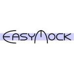
I could never unsee it in this old easymock logo https://www.javacodegeeks.com/wp-content/uploads/2012/10/eas.... They have since changed it to something much more neutral, thankfully!
Re:Grafana Loki – Like Prometheus, but for logs
by Fnoord on Wednesday December 12, 2018 @12:50PM
(#18666004)
I can't see it. In my world, penises are a little bit bigger than those proportions... might as well see a heart in the logo. I actually like the logo, as it looks like two things overlapping each other which can be moved to be aligned.
But on a serious note the developers should indeed look into this. I recall this comment from HN [0] which highlights why neutral branding and naming are important.
0: https://news.ycombinator.com/item?id=14702513