Re:Designing the Perfect Date and Time Picker
by brlewis on Wednesday July 18, 2018 @01:48PM
(#17560503)
Three inputs type="number"?
https://flems.io/#0=N4IgzgpgNhDGAuEAmIBcIB0ALeBbKIANCAGYCWMY...
Re:Designing the Perfect Date and Time Picker
by kalleboo on Thursday July 19, 2018 @12:08AM
(#17563879)
On iOS, using the date input field gives you the date wheels which work well https://docs.microsoft.com/en-us/xamarin/ios/user-interface/...
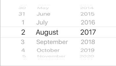
On desktop the standard for forms seems to be either 3 text fields (Y/M/D) or 3 dropdowns with the possible Y/M/D numbers in them
Re:Designing the Perfect Date and Time Picker
by ummonk on Wednesday July 18, 2018 @03:05PM
(#17561186)
1) Text entry that attempts to accept different formats and displays the formatted parse of the format next to it. Decent on desktop, text entry on mobile is poor.
Why not the standard MMDDYYYY (or DDMMYYYY depending on localization) format (with intervening static / /) that every credit card or user information form uses? Number entry on mobile is very easy.
Most date pickers assume that the date is in the near future and that the "day of week" context (ie: tuesday) is useful to the user is selecting the date.
Birthdays are the opposite. They are typically decades in the past, the user doesn't know or care what day of the week they are, and the user knows the numerical date by heart.
The only things I've come up with are:
1) Text entry that attempts to accept different formats and displays the formatted parse of the format next to it. Decent on desktop, text entry on mobile is poor.
2) Big array of Years / Month / Day buttons. The possible range of years is limited (nobody alive was born in year 1200) to a little over 100, so this does scale. User simply needs to tap on the correct button 3 times, which is nice, but the picker takes up sooo much visual space.