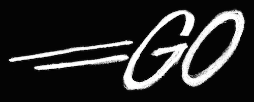
EDIT: Here [2] are the two logos side by side. The number of similarities would make this one hell of a coincidence.

movement lines aren’t original. they’re a classic visual archetype, commonly used to convey movement in static images. they exist in every comic book ever printed.
Sans-serif fonts in all caps consisting of two circular letters “G”and “O” can look similar, depending on who’s looking
no car
That is unfortunate phrasing. The Jordan, Jesse, Go logo has been used for roughly a decade and the podcast is older than the Go language. There is only one possible direction that any inspiration could have flowed.
Any one or two of these specific details can be explained away, but at a certain point the number of coincidence start to indicate that they are not in fact coincidences.
But there is not enough evidence here, to suggest that the new go logo lifted elements from that other logo.
Motion lines are not a coincidence they are a common solution to the problem of conveying motion in static imagery. It’s as common as using a cup when the problem being addressed is how to drink coffee.
A sans-serif word-mark is also not unique. It’s trendy. Everyone’s doing it. The major difference between the old google logo and the current one was the removal of serifs. For a company Google’s size that’s one expensive redesign just to remove serifs, since they had to get it re-printed on everything such as cars, signs, business cards, letterhead, clothing, etc. Going with a sans-serif is not an original design choice, it’s a trendy and safe one. And sans serif texts tend to look like each other in all caps with circular letters.
Ehh. I’m trying but I’m not seeing any peculiar elements that the two logos share, including the combination of public domain design choices, to the extent that would suggest one lifted from the other.
In fact, a font that looked like steel or concrete might be good. Wonder if there is one. If so, they could have made the logo to be just the word Go (as I spelled it as regards to case) in that font. Silvery steel font on a gray or black background, or some similar combination.
Even a font / image / logo signifying a rugged wood (mahogany or some hardwood?) in some way might have been a good one. Signifying the Go philosophy - a no-frills, just-get-the-work done-kind of language.
Just thinking aloud ... :)
- it ham-fistedly plays on the name Go (look, the logo is "going"...)
- it is not opinionated (it conforms seamlessly to contemporary corporate logo design, it looks like stock art)
- it does not repay sustained attention
Go is a brutalist language. Clean lines, no frills, lots of power, close enough to the metal. I want monotype, exposed beams and concrete, RTFM, no ugly movement lines.
I would actually rather they had taken a photo of the word "Go" written in concrete.
And honestly, I don't care about any of these things, it's just window dressing on a very solid programming tool. It's frustrating when the miss is that obvious, though. Whoever pushed this through was clearly very risk averse, rushed, or both.