> The monospace font reminds me of the console on old Sun workstations running SunOS.
Yes! It really does: http://toastytech.com/guis/sv411boot.png
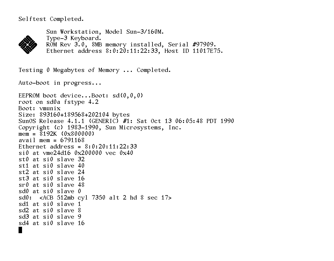
But I think it's mostly to do with the non-uniform line thickness (look at the asymmetry of the 'x').
To me it looks better than the SunOS font, but it certainly does resemble it. That's probably why it looks "old" to me, and not in a particularly nostalgic way. Then again, I didn't use Suns all that much.
Re:Go fonts
by fusiongyro on Wednesday November 16, 2016 @11:41PM
(#12974347)
It's easy to fix though. Just pour more Knuthian bullshit on it until the hackers think its flaws represent important aesthetic decisions. It was made by an important type foundry adhering to the strictest mathematical principles, after all!
It's pretty hideous. The alphanumerics feel rather slapdash, like this whole thing was put together by the foundary on a Friday afternoon and made to meet the minimum requirements but without much love.