But the old iPhoto icon was not only showing a camera, it was showing a camera and a photo. The camera is part of the icon because iPhoto/Photos can also be used to import photos from cameras that look exactly like the one in the icon. The old icon really couldn't be more fitting for what the app does.
And even if users don't know what a camera is, they can still recognise the other 50% of the icon.
Plus, Apple itself still uses the same type of camera in other icons, most notably on the current iOS lock screen, so I don't think anyone is confused by the iconography. Most people never compose a song and yet they know that iTunes' icon is a musical note.
Can they? who prints photos anymore?
People say things like this in defence of the recent Apple UI changes but completely ignore the [iOS6 camera icon](https://upload.wikimedia.org/wikipedia/en/7/7d/IOS_6_Home_Sc...) vs [iOS7+](http://static1.i4u.com/sites/default/files/imagecache/main_i...)
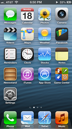

We went from an icon that literally looks like the iPhone camera to an icon of a point and shoot you and others claim is antiquated and not relevant.
Without 3D or lighting effects, a lens is just a few concentric circles. So a flat picture of a camera housing is less ambiguous, even though it is not what a phone camera looks like.
Digital SLR cameras still very much look like traditional cameras. Why? because the form is optimal for the task at hand - taking high quality pictures.
I thought the lament about the photo app dropping the icon that looks like a camera was particularly odd. He seems uninterested in even acknowledging the point that most cameras don't look like that anymore, and there are many (most?) full fledged adults who have never used a camera with a large attached lens.
I'd even wonder at this point if there are more people in the world familiar with Apple products than with actual apples that grow on trees, but I digress.