So the most important link on your entire web site is effectively still invisible. What message does this send to your potential customers? It's the Internet equivalent of leaving a message on an answering machine without leaving your phone number.
I don't understand how you can post this screenshot[2] and talk about information density. The information density of your current product is very low.
But the worst problem is the incredibly low contrast of your UI. Look at that screenshot again. Look at the links on the right side of the screen. They are barely readable on a full-size, matte monitor indoors. Now imagine someone using a glossy monitor facing a window during daytime. Imagine someone using a laptop with a glossy screen on a desk with fluorescent lights overhead. Imagine someone using a tablet outdoors. Might as well try to read a cloud floating overhead! The NN Group also has an article[3] about this, and your screenshot looks as bad as or worse than all of their examples of what-not-to-do.
Where are these professional "designers" learning to make these horrible mistakes? Why are they still employed in the field?
1: https://www.nngroup.com/articles/page-fold-manifesto/
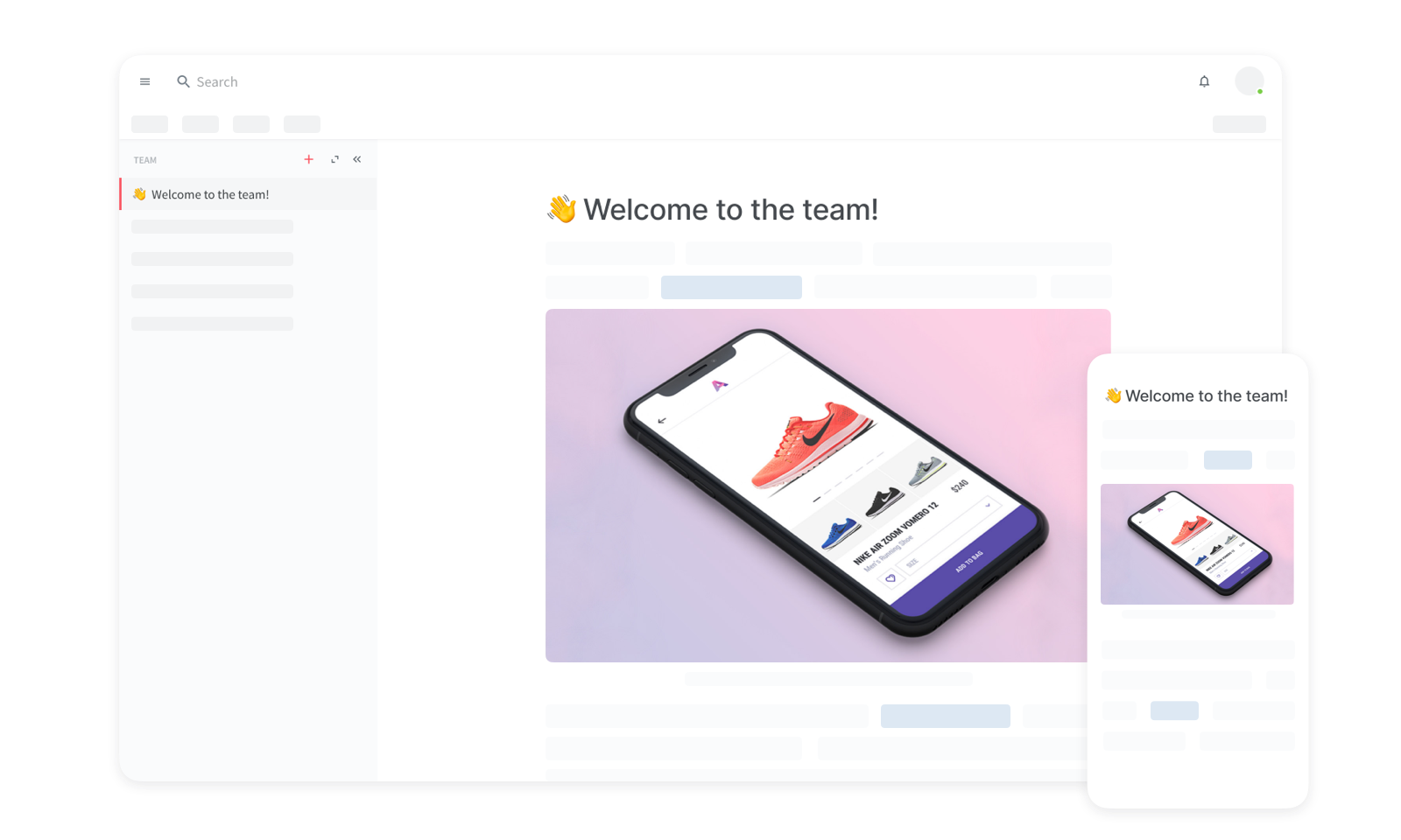
> So the most important link on your entire web site is effectively still invisible.
Where would you like the link to be and how should it look?
> I don't understand how you can post this screenshot[2] and talk about information density. The information density of your current product is very low.
What would you like to change exactly regarding the information density?
> But the worst problem is the incredibly low contrast of your UI.
Would a high contrast theme solve the problem for you?
In general, I am more than happy to offer you a Skype/Chat session, where we could discuss the design in more detail. Feel free to drop me a line at [email protected]
Regarding the product, themes and customizations will most likely be the best option to maximize the usability for each individual user. This way, users could choose high contrast themes if they are not happy with the default.
As for the general design question you are proposing, my opinion is that there is no one-size-fits-all approach that pleases and maximizes the usability for everyone. For example, making all text larger might increase readability for people with below average eyesight, but will punish users with normal eyesight by decreasing the information density. I think that adaptive design, which software can uniquely offer to some degree, is the only hypothetical solution. However, this is obviously limited by the context-awareness of systems in that it doesn't help that a system could automatically adjust it's font-size if it does not know the state of the users' eyesight.