All of the buttons are non-standard, but the gridview headers and tab controls are standard: https://www.wxwidgets.org/about/screenshots/cars-hotsurf-msw...

Non-standard toolbar buttons, repositioner handles, and rendering and location for tool-window close boxes: https://www.wxwidgets.org/about/screenshots/audacity-msw.png

Skinned background and non-standard grouping panels, but standard buttons, menus, textboxes, etc: https://www.wxwidgets.org/about/screenshots/boinc.jpg

Non-standard coloring on buttons in toolbar: https://www.wxwidgets.org/about/screenshots/ginkgo-windows.j...

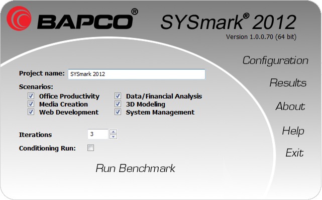
Link-buttons used for commands ("Run Benchmark") and reskinned, giganto elements mixed with standard, tiny elements: https://www.wxwidgets.org/about/screenshots/sysmark2012.jpg
An MDI hacked together out of grouping panels: https://www.wxwidgets.org/about/screenshots/trident-msw.jpg
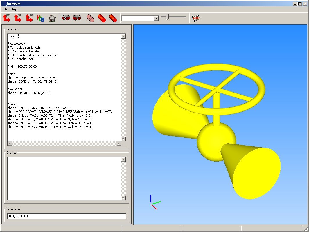
There was absolutely no reason to reskin these buttons and textboxes. Skeuomorphism is bad design: https://www.wxwidgets.org/about/screenshots/audio-evolution-...

A hacked together Ribbon view out of a tab-view placed in the toolbar location, but they also include a separate toolbar section. Finally, that "calculate" button should follow its config elements, not precede them: https://www.wxwidgets.org/about/screenshots/coppercube-msw.j...

Furthermore none of your nitpicks are due to wxWidgets itself and are mostly due to the application developer making usability choices (i.e. using customized buttons, grouping toolbar buttons using color, etc.) or simple mistakes (like forgetting to turn off the grid view header).
  I know they haven't built these programs themselves, so it's not necessarily their fault
  that these developers have gone with the everything-and-the-kitchen-sink style of UI
  design. But they also chose to feature these particular projects, so someone there
  thinks these are good examples, which does not speak well towards their commitment to
  enabling good design.
I mean, have you even used KiCAD? It's an absolute abomination of UX.
You know how programmers have a reputation for being bad at design? You know how programmers have a reputation for "not having any common sense"? This is why.
TBH your argument sounds like a designer trying to justify being a designer. No real users are "confused" by any of the things you've nitpicked about. You're conjuring up some uber-stupid theoretical user as a strawman. But feel free prove me wrong by finding real people on the web complaining that they're confused by those issues.
Also, it doesn't help that most of the screenshots are quite old. Where are the apps running on Windows 10? The OSX screenshots, when present, are from the first OSX versions.
Qt comes to mind - which allows simple css styling of the whole UI, applied everywhere, in a simple manner – but still can look native.
AFAICT, all of those screenshots are using the standard wxWidgets UI elements, with the obvious exceptions of the audio waveform, the on-screen keyboard, and the 3D graphics widget, which will not be standard components in any GUI toolkit.
The variation is due to the users taking the screenshots using different themes or styles in Gtk, KDE, Windows, etc..