Re:Ask HN: What's your favourite typeface?
by danbolt on Sunday February 21, 2016 @09:26AM
(#11144586)
Other typeface fact! The title text in 2001 uses capital O's instead of zeroes. [1] The zeroes in Gill Sans are thinner than the O's, so part of me thinks Kubrick wanted the logo to look more futuristic.
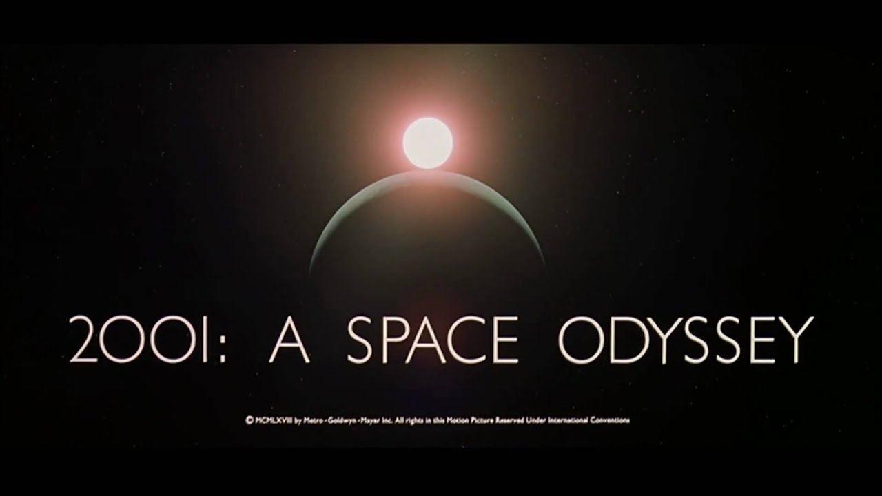
Source: (http://www.theguardian.com/film/2004/mar/27/features.weekend)
The Nike logo is also from the Futura family (https://www.quora.com/What-font-is-used-for-the-Nike-logo)