For a font designed in 1931, it's impressively timeless. It doesn't seem to communicate any particular era or emotion, so it suits almost anything especially in digital form.
Both Google's Roboto and Apple's new San Francisco display fonts seem heavily inspired by DIN (just IMHO of course).
I'm not wholly sure about that; the strict adherence to line thickness and limited set of curvature angles make me feel like it was adapted from the "font" created by necessity when using road-painting equipment to write asphalt road signs. It which lends the font a "we couldn't do better in one case so let's at least unify on something" feeling that's slightly modernist, similar to logos from the 70s that use unnecessary all-caps to look "digital" because they work with green-screens that don't display lower-case.
The de rigueur digital version is FF DIN by FontFont, which was released in 1995:
https://www.fontshop.com/families/ff-din
The changes made in this 1995 version are described thus:
"The shape of the new FF DIN differs from the original mostly by thinner horizontal strokes and by more fluent curves."
So, sounds like you're absolutely right -- line thickness and curvature were reworked to make the typeface more generally useful. (To my taste, all the weights of FF DIN look excellent on a high-dpi screen.)

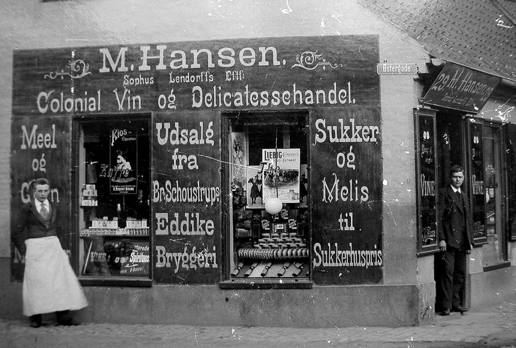
For instance, this sign from 1897 [1] contains many examples of it, even on the street sign on the top right corner.
For more examples, I suggest a browse through http://www.copenhagentype.dk/
[1] http://www.lundwp.lamp.magnifik.dk/wp-content/uploads/2013/1...
> In April 2014, FHWA indicated it expects to rescind Interim Approval to use Clearview.
Tobias Frere-Jones came up with a typeface called Interstate in 1990s that's quite similar but adapted for print and screen. It's a nice typeface. Red Hat released a FOSS variant called Overpass. https://fedoraproject.org/wiki/Overpass_Fonts
Real life example: http://www.trelleborg.se/files/Centralt/Bilder/Historiskt/By...

https://en.wikipedia.org/wiki/Frutiger_(typeface)
I like (am used to?) the Italian one too:
https://it.wikipedia.org/wiki/Alfabeto_Normale (derived from https://en.wikipedia.org/wiki/Transport_(typeface) )
I don't much care for the Austrian/German ones though:
https://en.wikipedia.org/wiki/DIN_1451 - apparently it was designed by committee.